Jeff Kindred resumé
portfolio
DesignUX and visual
PrototypeHTML/CSS/JS and motion
ResearchFacilitation and reporting

The work I chose to share here is a small portion of the work that is not under NDA. Additional details and more work is available upon request.

Consumers EnergyResponse to RFP
Fresh DirectResponse to RFP
TargetVisual style guide
AllerganFull project wireframes
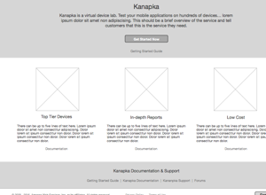
AWS Device FarmFull project wireframes
AWS IoTSide project hi-fi wireframes
AWS Kinesis FirehoseFull project HTML prototype
AWS IoTSide project HTML prototype
Nike mPOSExploratory motion prototypes
AWS Device FarmNew product research
AWS API GatewayFoundational research
Background

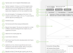
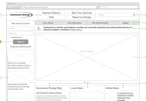
In mid 2012 I was tasked with creating designs in response to an RFP. I was given 2 weeks to reimagine Consumers Energy's existing feature set into a responsive web solution. You will see samples of the wire frames that were included in the RFP below.

Download full PDF
Background

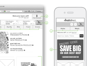
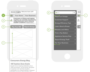
At the end of 2013 I was tasked with creating designs in response to an RFP. I was given 2 weeks to reimagine Fresh Direct's existing feature set into a responsive web solution and accompanying mobile app. You will see samples of the wire frames that were included in the RFP below.

Download full PDF
Background

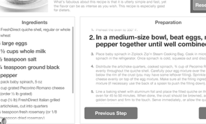
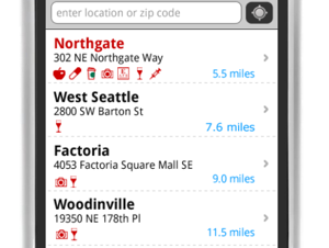
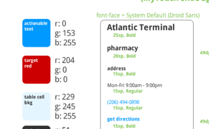
In 2011, Target was the primary client that I worked for. I was responsible for the design of their Android application. Below you will see samples pulled from the pseudo-style guide that I prepared for them.

Download full PDF
Background

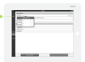
In 2012, Allergan was my primary client. I was responsible for designing their mobile sales iPad app. After launch, the proposed training was cut in half due to the ease at which sales reps were learning to use the application. You will see a couple of examples of the wireframes below.

Download full PDF

Background

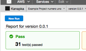
In early 2015, AWS acquired AppThwack, a mobile device testing service. I was tasked with taking their existing UI and redesigning it to fit within the AWS platform while adding some needed UX fixes.

Download full PDF
View research performed for this project
Background

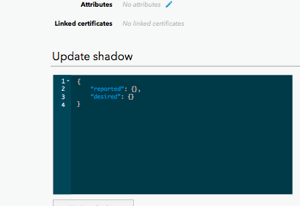
During the holidays in late 2015 I had some extra time and decided to redesign the newly launched IoT service. What was launched did not fit into the AWS platform very well so I used the also recently launched Mobile Hub as a guide for the redesign.

Download full PDF
View the HTML prototype

Background

In late 2014 and early 2015 I worked with the Kinesis team to design and launch the new Firehose service. The service is used to pipe streaming data from a source to a destination without having to build the pipe yourself.
I initially sketched out some ideas and wire framed the initial ideas to get buy-in from the stakeholders. Once we agreed that we were heading in the right direction, I began building an HTML prototype to better communicate the intracacies of the design to the developers. None of the developers that I worked with on the project had much front-end experience so it was crucial for them to have a fully functioning prototype to refer to during implementation.

View full prototype.

Background

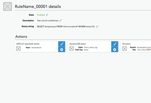
During the holidays in late 2015 I had some extra time and decided to redesign the newly launched IoT service. What was launched did not fit into the AWS platform very well so I used the also recently launched Mobile Hub as a guide for the redesign. I decided to build an HTML protottype to keep up on my front-end engineering skills.

View full prototype.

Background

In 2013 I worked as lead UX designer on Nike's mobile point of sale app. During that time I occasionally developed motion prototypes to weigh options and have discussions with the developers and stakeholders. The prototypes that you see here are micro interactions with adding an item to the cart and viewing how the total cost is calculated.

Background

Mid 2015 our research team was very busy and I was unable to get a study picked up that I wanted to do for a soon-to-be-launched service that I designed the management console for. In turn, I took it upon myself to run the study and get the findings on my own. I have included the report in full below.

Amazon Device Farm usability report

Last week we ran a baseline usability study on the new Device Farm management console. Overall, participants were overwhelmingly successful at completing all tasks presented to them during the study. We received a bunch of feedback from the participants about the console and the service's documentation. The 6 participants for this study were all internal Amazon employees that have experience with a native mobile app development workflow. This study was performed as a self-service study run by the designer for the team with assistance from the research team. This is done occasionally to expand the research team's capacity. Note that these studies have shorter reports than full studies.

The following write up will go over the highlights from the study. If you have any questions about particular data points or findings in the report, please let me know and I will be more than happy to elaborate.

What went well
  • Every participant was able to upload an application and run tests on it successfully
  • Every participant was able to envision Device Farm augmenting there workflow
  • Run reports contain the right data
  • Recently uploaded selector was well received

What went less well
  • Screenshots are overbearing and should only be shown as-needed
  • Device pool creation is confusing especially when rules are added
  • No list of supported devices in the documentation
  • The value of the fuzz-test isn’t immediately apparent

Create new run wizard

Participants were asked to create a new run via the wizard. We provided them with an Android application package and a set of Calabash unit test scripts for the task.

Recently uploaded
The recently uploaded selector was well received by all participants. One participant even canceled a pending upload to go back and use the “recently uploaded” instead.

Device pools
  • All participants were surprised to see iOS devices after they had uploaded an Android application. Most said they expected the pool selection control to be “smarter”
  • Half of the participants clicked on the compatibility table’s status icons expecting it to deselect incompatible devices
  • The device compatibility alert was seen as a blocker: “I have to get to 100% compatibility before continuing”
    • Most participants missed the part of the alert that said incompatible devices would be ignored during the run
  • 2 participants started creating a rule based pool expecting it to filter the table and became confused when they couldn’t select or deselect devices
  • Once understood, rules were seen as very powerful and could include lots of parameters. i.e. creating a pool for Samsung tablets with XHDPI displays running Android 4.2 - 4.4.4.
  • “Type” was an unexpected label for the device's form factor. 
  • Most participants were interested in a device’s market share as one of their selection parameters. This may also be a desire to understand how devices are ranked within Device Farm.

Review
All participants wanted to see more information than what was displayed in the review step: 
  • Number of devices in selected pool
  • Device state info (fixture info?)
  • More info about test scripts/package


Reports

Participants were given the task of analyzing the report as they normally would after running a set of tests on their application. Overall, participants were happy with the level of detail and data displayed in the reports.

Runs list
Most participants clicked on the ‘stop light’ status badges expecting the resultant page to be scoped to the selection that they had just made.

Breadcrumbs
Participants called out that they really appreciated the breadcrumbs for giving them a quick view into where they were within a given run.

Screenshots
The amount of screenshots that were taken with the test script we used caused the browser to crash numerous times during the studies drawing a lot of attention to the screenshot section of the reports.
  • Every participant felt that the full-size screenshots were overwhelming and quickly became less than useful.
  • Most participants suggested thumbnailing as a first resort and also suggested a light-box style interaction as ideal.
  • Every participant said that displaying screenshots for every test all at once was unnecessary and they would be ok with having to “request” the screenshots.
  • A few participants felt that there could be more data accompanying the screenshots so they could more easily correlate them with a specific log entry or time during the test.


Service Documentation

Participants were given the service’s alpha-documentation to gain an understanding of what the service is capable of. Engagement with the documentation varied greatly from skimming over it to get a quick high-level understanding to reading every page verbatim.

Supported Devices
Every participant mentioned that it would be nice to see a list of supported devices in the documentation. A couple participants mentioned that it might be more beneficial to see what devices are not supported. One participant even questioned whether watches were included as a supported device.

Key terminology definitions
Two participants stated that they felt the key terminology definitions were listed backwards. “The definition for ‘project’ uses the word ‘run’ which is defined in the second list item."

Described visuals
In the documentation there are a couple sections that describe what the UI looks like. Every participant that got to those sections mentioned that they would rather see an image such as a screenshot instead of a description of the UI. 

Value of fuzz test
Participants were excited about the built-in testing ability but were confused about its value. They were unable to immediately understand what the fuzz test would do to or for their application.

Service Cost
Two participants questioned how much the service would cost and could not find the answer in the documentation. 

Service Limits
One participant was confused when he read the device limits bullet point: "The maximum number of devices that Device Farm can test during a run is 5 (but can be increased on request).” He interpreted that to mean he was only going to get 5 devices per run regardless of the number of devices in his pool.


Additional feedback and suggestions

As the last task of the study, we asked participants if there was anything that they wanted to discuss that we hadn’t covered in the other tasks and we received quite a few suggestions:
  • The ability to select device location from a map would be nice to have. It was also mentioned that it might be nice to have a random generator for fields that can be random such as device location
  • One participant mentioned being able to set the upper and lower display limits on the performance graphs to have a more consistent experience viewing performance within a run
  • One of our participants was very security aware and mentioned that some low-level application vulnerability checks as part of the testing process would be really helpful
  • Being able to download a specific filtered subset of the logs would be helpful to have an output of a specific failure
  • All participants felt that having 3rd party integrations would be crucial. Mentioned specifically were CodeDeploy and an Eclipse plugin. Mentioned less specifically was “integration with my build platform"
Background

In late 2016 it became clear to me that a team that I was consulting for within AWS didn't really have an understanding of how their customer's were actually using their management console. I wanted to solve this by observing customers using the console in their own environments with their own accounts. This is a unique type of study and wasn't a very high priority for the research team so I took on the task of running the study by myself. I had some help from the research team to track down customers that were willing to share their data with us via screenshare. I have included the full report below.

AWS Usability Results: API Gateway

Overview
From December 5th-9th we conducted a usability study on the currently live API Gateway console. This console allows customers to create and manage public APIs. During the study we allowed customers to explore the console from their own machines using their own accounts to understand how they are using the service on a regular basis.

No video clips will be shared as customers were using accounts with their or their companies data available to us for the duration of the recordings. 

Participants
All 5 participants were existing external customers of AWS and had used the API Gateway console at least once. Most of the customers had used the API Gateway console more than once.

Study format
Sessions were 60-minutes and consisted of initial questions where we asked participants to tell us about their company and their role. We then asked questions about how they create and manage APIs and how many APIs they manage/have created. We then asked the participants to share their screen and walk us through their normal operations in the console. If they didn’t perform operations on a regular basis we asked them to walk us through the creation of a new API. At the end of the sessions, we opened it up to let participants talk about AWS in general if they had feedback.

High level findings
What went well
  • Participants liked that they can use the console to do things quickly
  • Participants saw the console as something they could use to ‘set and forget’ 
  • When used, the dashboard was seen as useful

Where participants struggled
  • Participants had trouble coming up to speed on the service quickly
  • The method flow view is confusing at first
  • Request and response mapping configurations are hidden and sometimes confusing
  • Lambda proxy integration was overlooked even though most participants would benefit from its us
  • APIs being publicly accessible

Detailed findings
Coming up to speed on the service
All participants mentioned that it took them a lot of effort to come up to speed on what the console and service was capable of doing for them. Once they understood what the service was capable of providing them, it took them even more time to fully understand what was expected to make the service do exactly what they were expecting. All participants had read the documentation to gain their understanding but mentioned that the console could do more to help them initially.

Method flow view can be confusing 
All participants struggled at least once to recall where they could or had previously accessed a specific configuration available via the method flow view. One participant clicked on the integration more than once expecting to modify it’s configuration instead of view the Lambda function. Multiple participants clicked on two or three cards [blindly] in hopes of recognizing the UI they were looking for. Ultimately, every participant understood the view and why it is laid out the way it is, they just struggled to remember where configuration options lived.

Request and response mapping is hidden
All participants knew that they needed to do something to get the correct responses from their methods, they struggled to find where those configurations needed to be made. Once they found where the configurations were, they tended to do a lot of guess-and-check to get the mappings right. Most of the participants said that it would be nice to have some [better] examples or default mappings available to them in the UI. 

Lambda proxy integration
The majority of participants were doing fairly simple things with API Gateway. Most participants had configured their APIs and got them working and then just left them alone. Some of these participants were coming back to the console for the first time since they initially got up and running and were either not aware of new features or not willing to exert the effort to incorporate them. All participants in this position agreed that the Lambda proxy integration would make the configuration of what they were doing easier had it been available when they initially configured their API or had they been made aware of it in the time since.

Desire to lock down an API as private
About half of the participants expressed a desire to have their APIs accessible only via VPC. This was a desire to have a “private” API or a public API restricted to a specific range of IPs.

Lambda function selection for request integration
One participant brought up a minor point when attempting to use a Lambda function that was already being used for another method that they didn’t know if the permissions were being added to or overwriting the existing permissions.

More/better metrics 
One participant expressed a desire to have more fine grained metrics on the methods. The participant called it “tracing” which they got from Apigee. They want to see where the method is spending its time so they can make improvements to the total response time in the appropriate places.

Deployment required for stage not implicit
About half of the participants attempted to create a stage without first deploying their API. This led to a bit of confusion around how to deploy the API which is not as evident as creating a stage. All participants were eventually successful in deploying their API and creating a stage or multiple stages.

Important data seems hidden or buried
At least one participant mentioned that they thought the endpoint URL was one of the most important pieces of data after the API is created and that they felt like it was buried and difficult to get to. They recommended that it be elevated and become more apparent

Duplicate save buttons
One participant showed a view where there are two save buttons at the same time and spoke about how it confused him. He wondered if clicking one of the buttons would save everything and the other would just save the section that was being worked on at the moment. Regardless he wanted that to become clear so there was no further confusion.

Publishing documentation 
One participant that was utilizing the new documentation feature expected the “publish documentation” button to create a dev portal for them. They did not realize that it was just publishing it to a stage. They made a point to say that they would like an easy way to publish the documentation to a dev portal even if its not a custom implementation.

Appendix
Feedback from participants not related to API Gateway specifically
  • Lambda - Ability to see into and edit uploaded packages just like inline editing
  • DDB -  A query language/editor to see their data in the console
  • Service menu - All participants made a point to call out how helpful the new search feature was and that it made their lives much easier
  • Console home - Most participants called out the redesign and had positive things to say
  • Console home - At least one participant mentioned that they wanted the ability to pin more services.
  • Console home - At least one participant talked about wanting to have more control of what is displayed on the page to customize it to their workflow.

Thankings
Thanks to Brett Burnside for handling the participant and room bookings and the logistics in general. 
Thanks to the API Gateway console team for listening in to the studies and asking follow up questions and answering questions when needed.